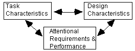
FIGURE 1. Design, Task, and Attentional Performance
Harrison, B.L. ,Ishii, H.,Vicente, K. & Buxton, W. (1995).Transparent Layered User Interfaces: An Evaluation of a Display Design Space to Enhance Focused and Divided Attention. Proceedings of CHI'95, 317-324.
Transparent Layered User Interfaces:
An Evaluation of a Display Design to Enhance Focused and Divided Attention
Beverly L. Harrison1,3 Hiroshi Ishii 2 Kim J. Vicente1 William A. S. Buxton3,4 1Dept. of Industrial
Engineering
University of Toronto
Toronto, Ontario, Canada
M5S 1A4
beverly@dgp.utoronto.ca
benfica@ie.utoronto.ca
2NTT Human Interface Lab
1-2356 Take, Yokosuka-Shi
Kanagawa, 238-03 Japan
ishii@chi.xerox.com
3Alias Research Ltd.,
110 Richmond St. East
Toronto, Ontario, Canada
M5C 1P1
4 Dept. of Computer Science
University of Toronto
Toronto, Ontario, Canada
M5S 1A4
buxton@dgp.utoronto.ca
This paper describes a new research program investigating graphical user interfaces from an attentional perspective (as opposed to a more traditional visual perception approach). The central research issue is how we can better support both focusing attention on a single interface object (without distraction from other objects) and dividing or time sharing attention between multiple objects (to preserve context or global awareness). This attentional trade-off seems to be a central but as yet comparatively ignored issue in many interface designs. To this end, this paper proposes a framework for classifying and evaluating user interfaces with semi-transparent windows, menus, dialogue boxes, screens, or other objects. Semi-transparency fits into a more general proposed display design space of "layered" interface objects. We outline the design space, task space, and attentional issues which motivated our research. Our investigation is comprised of both empirical evaluation and more realistic application usage. This paper reports on the empirical results and summarizes some of the application findings.
ABSTRACTKEYWORDS: display design, evaluation, transparency, user interface design, interaction technology
The associated psychological problem we are addressing is that of focused and divided attention. When there are multiple sources of information we must make choices about what to attend to and when. At times, we need to focus our attention exclusively on a single item without interference from other items. At other times, we may need to time share or divide our attention between two (or more) items of interest. In this case, we rapidly switch attention back and forth between the items (necessitating minimal "switching costs"). There is a trade-off between these attentional requirements (depicted in Figure 4).
The need for focused or divided attention is largely determined
by the demands of the user's task. However, our ability to successfully
focus or divide (share) attention can be enhanced or degraded by the display
design choices we make. For example, opaque overlapping window designs
are problematic for divided attention (some information cannot be seen)
but facilitate focused attention (the hidden background window cannot create
visual interference). The interaction between the task characteristics
and the design characteristics determine the attentional requirements and
performance (Figure 1).
FIGURE 1. Design, Task, and Attentional Performance
Task characteristics largely determine attentional requirements and minimum acceptable performance levels. These task characteristics are pre-determined based on the nature of the work. Design characteristics (e.g., level of transparency) facilitate or prevent the task goals from being attained, limiting attentional performance. Our approach is: given an understanding of the task, can we manipulate the design characteristics to produce the necessary attentional performance?
Several key design issues need to be investigated if users are expected to focus on or divide attention between two superimposed images. Can users selectively attend to a chosen "layer" without visual interference from the other? Are there certain display characteristics or task properties which facilitate or preclude overlapping displays? How do these design choices affect attentional performance?
On the one hand, the depth multiplexing approach offers the best of both worlds: windows need not be tiled to be visible. Hence, ideally, less information is obscured. On the other hand, the potential for content of one window interfering with another above or below it is introduced. Our prototypes show clearly that in some situations the technique works well, while in others there are real problems. The objective of our research agenda, of which the current paper is a part, is to develop a more formal understanding of the constraints of such an approach.
We propose a design space that captures the above three strategies and applies, in general, to foreground and background interface layers (Figure 2 and Figure 3). This design space allows us to methodically categorize and investigate both existing technologies and more novel technologies.
In one dimension (upon which this paper focuses), we vary the level of transparency/opacity between the two displays. Fully opaque objects reflect traditional window, palette, and menu design in current graphical user interfaces. Fully transparent designs reflect some of the more advanced interfaces such as those used in Heads Up Displays (HUDs) in aviation [12, 18] or in the Clearboard system [5]. In HUD design, aircraft instrumentation (a graphical computer interface) is superimposed on the external real world scene, using specially engineered windshields. In the Clearboard work, a large drawing surface is overlayed on a video image of the user's collaborative partner. Semi-transparent designs include such things as video overlays (like those used in presenting sports scores while the game is playing), "3-D silk cursors" [19] or Toolglass-like tool palettes [2,7].
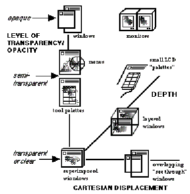
FIGURE 2. Design Space Dimensions
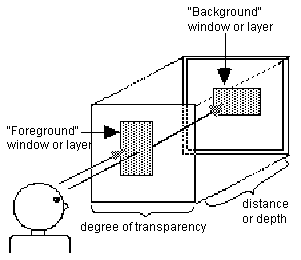
FIGURE 3. Concept of Layered Displays
Along another dimension we can vary the perceived depth of the planes between two displays, where one image appears closer to the user while the other is in the background. This can be accomplished using half-silvered mirrors, polarizing filters, or special transparent LCD displays (creating binocular disparity or stereopsis). In this case, the user looks through the display presented in the foreground to see the display presented in the background (e.g., [10]). Layers on this axis are distinguished by both transparency and depth. There are limited examples of such systems. Knowlton [9] used graphical overlays projected downwards onto half-silvered mirrors over blank keyboard keys to dynamically re-label buttons and functions keys (e.g., for telephone operators). Schmandt [16] built a system to allow users to manually manipulate and interact with objects in a 3-D computer space using a 3-D wand. Again a half-silvered mirror was used to project the computer space over the user's hand(s) and the input device. Disney has also developed a product called the "ImaginEasel" for animators and artists. ImaginEasel keeps the user's hand and input device in the workspace (using mirrors).
The proposed design space provides us with a means of categorizing both existing technologies and new technologies. However, the utility of any particular design will depend upon how well it supports the task characteristics and goals.
Focused attention examples:
To facilitate focused attention (ignoring information from the background layer while focusing on the foreground) we want to make the attributes of the information on foreground objects as different from the background as possible. We also wish to reduce the visibility of the background objects. This will minimize interference. By contrast, for divided attention (being able to see both foreground and background layers), we need to support simultaneous visibility of both layers. However, the user must still be able to separate which features belong to the foreground and which to the background in order to accurately perceive the objects.
There are many ways of achieving differentiation between layers (with varying success), such as different colors, content attributes - analog (images or graphics) versus verbal (text based), font sizes or styles, etc. Many of these features are pre-determined by the task. The level of transparency effects visibility of the background. Low degrees of transparency (more opaque) distinguishes the appearance of the foreground and background object, allowing the user to easily focus attention on the foreground. For divided attention, a high degree of transparency is desirable to support higher visibility of both layers.
Clearly there is a trade-off between these two goals. We need to support this trade-off since most real world jobs require both focused and divided attention. We have characterized the trade-off in Figure 2 which provides a framework for this research. We have used level of transparency as the visibility control variable. From this analysis, we can predict that the optimal degree of transparency is determined by the trade-off of supporting both focused and divided attention. As degree of transparency increases, it gets easier to divide attention between information on the top object and information on the background object but more difficult to focus attention on either object exclusively. The optimal transparency (OT) is a result of a trade-off. The curves and the location of optimal transparency in the figure are hypothetical but may reveal the trend. The non-linear nature of the curves is also proposed but appears to be supported from our preliminary experimental work.
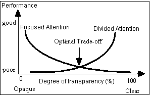
FIGURE 4. A simple model of transparency selection.
Kohler [11] originally investigated selective looking (monitoring dual tasks) by building headgear using half-silvered mirrors which presented the scene of the world in front of him superimposed on the scene of the world behind him. He reported that he could easily switch between these two views; the unattended scene seemed to "disappear" from sight.
Motivated by this work, further studies were carried out [15, 1] using two superimposed video images presented on a single monitor. In the first study [15] the tasks were visually distinctive: a hand slapping game and a ball tossing game. In the later study [1] both tasks were visually similar ball tossing games; the tasks were differentiated by the color of the shirts worn by the players. In both cases, subjects were asked to monitor one task and indicate the irregular occurrence of target events in this task. Meanwhile, bizarre events were sporadically presented in the non-monitored task. Subjects were easily able to monitor the target task to the exclusion of the unattended task. Subjects did not notice the bizarre events, even when the experiment was stopped during or immediately after the bizarre event occurred and the subjects were asked about it. This result still held when the bizarre event was presented in the exact same visual location where the target event occurred (i.e., within foveal range). This seems to indicate that the intentionally unobserved task goes virtually unnoticed. A number of alternative explanations for this phenomenon were discussed and discounted. This work suggests that two superimposed video tasks can be easily monitored with minimal interference. However, the extent of simultaneous task awareness is unclear.
Similar results in selective looking have been found in studies of dual task monitoring in Heads Up Displays typically used in aircraft control and navigation tasks. Specific advantages cited include improved flight performance, superior object tracking, [12, 18]. The primary disadvantage is "attentional tunneling" - fixation on the HUD to the exclusion of events in the real world, particularly unexpected events (or vise-versa) [18]. Again subjects are easily able to differentiate either display layer easily. Practice seems to improve simultaneous monitoring performance.
This previous research, though not applied directly to graphical user interface design per se, suggests promising evidence for the use of superimposed transparent displays. Based on these results, one would anticipate reduced switching time and improved awareness by minimizing head and eye movement and re-focusing. Also, one can reasonably anticipate that users will be able to treat the sources separately and voluntarily attend to one or the other (with varying degrees of interference).
As in most interface designs, one can anticipate some inappropriate applications and pitfalls as well. In cases where "missed observations" have a high cost, reducing visibility through transparency might be undesirable. Also if both tasks must be simultaneously monitored and both have high attentional demands, the attentional tunneling problems might arise. Finally, while this would seem feasible for distinctive types of information, we must evaluate how well this technique works for visually similar information types.
To reveal how focused and divided attention changes, i.e. how the curves in Figure 4 are shaped, we are conducting formal experimental studies with well controlled models and simulations. By varying the degree of semi-transparency in between the two layers, the experimental results provide us with precise performance measures on how well the user can see both foreground and background information and on how high the interference is between the two "layers".
However, we realize that controlled experimental paradigms address a restricted set of design dimensions only. Real applications consist of a much richer task space. We have also developed several prototype systems which are more representative of real world applications. We are evaluating these systems and observing user behavior to gain further insights into the design of transparent user interfaces. This combined research program allows us to further formulate research issues while remaining confident that our research results have external (real-world) validity. The two approaches are conducted in parallel.
Our experiments test how varying transparency effects interference between the displayed word and the color target, using a traditional Stroop test. The Stroop test was used to evaluate interference because it provides an sensitive, extreme measure of the extent of interference. As such, it should suggest worst case limitations. In our experiment, the word is seen by looking "through" the color patch. At high levels of transparency (e.g., 100% - clear) we anticipate that users will experience high levels of interference from the word when they try to name the color (difficulty in focused attention). As the color patch becomes more opaque the interference from the word should decrease (making focused attention easier). This would support the focused attention curve in Figure 4.
We used the word naming component of the Stroop Test to test the divided attention curve proposed. In this case users are asked to ignore the color patch and read the word in the background layer. This experiment reflects more of a legibility test, necessary for divided attention. The color patch in the foreground is always clearly visible and perceived. By reading the background word the user is, in effect, creating a divided attention task. At high levels of transparency (e.g., 100% - clear) it should be very easy to read the background word (divided attention is easy). At more lower levels (opacity increases) it should become progressively more difficult or impossible to read the word (loss of ability to divide attention).
When combined, results from the two experiments suggest interface design parameters where interference is minimized and the word is still fairly legible (awareness is preserved).
We anticipate more interference as transparency increases and therefore reduced performance as shown in Figure 4. Furthermore we anticipate a leveling-off point where performance does not continue to degrade.
H2: As transparency increases the response time and errors will be unchanged for the word naming task.
We anticipate that as transparency increases the word gets easier to see and is therefore faster and more accurate to read.
A fully randomized, within subject, repeated measures design was used. There were 4 conditions: non-conflict or neutral (the word was a neutral word), incongruent color (a conflicting color word was present), congruent color (the color word matched the color of the patch), and baseline (color or word only). Transparency levels of 0%, 5%, 10%, 20%, 50%, 100% were used for all word-color combinations for a total of 180 unique combinations. For each of 16 subjects, three sequences of the entire set of 180 images were shown. Trials were presented in random order at 5 second intervals. Each experiment lasted about 45 minutes. Verbal responses were logged within 1 msec of accuracy. Errors in response were recorded. Error trials were removed from subsequent analysis of response times.
Subjects were debriefed at the end of the experiment. Open ended comments were recorded and the experiment was video and audio taped for analysis purposes. Response times and errors were logged by the computer.
Post-hoc analyses were carried out to compare means for the transparency and word type (Student-Newman-Keuls test with alpha levels = .05). Response times for transparency levels occurred in four statistically significant groupings: 100%+50%+20%, 10%, 5%, and 0% (baseline condition). As expected, word types were grouped according to the predicted Stroop Effect: incongruent (color name conflicted with color word), neutral+congruent, and blank (color only - baseline condition). Our primary interest is in the effect of transparency under maximum interference conditions (incongruent word). The mean response times of primary interest are shown in Figure 5.
At 5% transparency (word was only slightly visible) the means across all word types are not statistically different from 0% (no interference/Stroop effect). At levels above 10%, three groupings of means occur (as the Stroop effect would predict): blank, congruent+neutral words, and incongruent words. Interference peaked at 50% - increasing transparency did not degrade performance.
Subject errors in response occurred only occasionally (average of 4 per 540 trials) and almost exclusively on the color-incongruent trials. Errors were approximately evenly distributed across all levels above 5% (5% showed few errors). Error trials were not used in the above analysis.
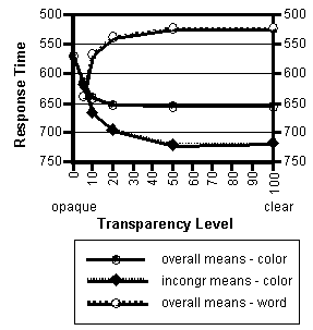
FIGURE 5. Mean response times
Post-hoc analyses were carried out to compare means for the transparency and transparency * color interactions (Student-Newman-Keuls test with alpha levels = .05). Transparency levels occurred in three significant groupings: 5%, 10%, 100%+50%+20%+0%. The baseline word only condition (0%) was not statistically different from the 100% condition (word with color background). Analysis of word type showed an unexpected Stroop Effect (despite counter-balancing order with the color naming experiment).
For levels of transparency of 5% subjects reported great difficulty in seeing the word, about 15% of the trials were errors. (Subjects reported "none" when they could not make out the word.) At 5% and 10% levels, certain colors produced better performance (lower response times, fewer errors) than others. Yellow was "easiest" followed by green (by post-hoc analysis of means). Blue and red were "hardest" and not statistically different. For transparency levels above 10%, subjects made virtually no errors and performance was consistent across colors. At 20% levels and higher, all words were easily read and there were no significant differences in response times.
Word naming seems highly error prone at levels of 5%. At levels of 10% subjects could accurately name most of the words, though they seemed to perform slightly better, depending upon what the background color was. It seems that there was an interaction between saturation/luminance and legibility. This suggests that certain colors might be more profitably used in transparent windows or interfaces - though this remains to be tested. Word naming performance improved more dramatically than hypothesized, with performance leveling off at 20%. Our hypothesized divided attention curve seems to underestimate the effect of increased transparency. Also we did not observe the hypothesized continual performance improvement but rather saw performance roughly peak and remain constant from 20% transparency to 100%.
The Stroop test was used to evaluate interference between transparent layers because it provides an sensitive, extreme measure of the extent of interference. As such, it should suggest worst case limitations. Our results suggest that for divided attention tasks, substantial performance gains occur within the first 20-25% transparency, but may not occur from 20% to 100%. Levels of 5% or less do not seem usable. For focused attention tasks, there is a rapid performance degradation between 5% and 50% transparency. At 50% performance is at it worst and does not deteriorate substantially with further increases in transparency.
Clearly, different tasks will have different levels of error tolerance and acceptable performance limits. Also the legibility of layers will be determined by visual distinctiveness in addition to overall transparency levels.
We installed transparency into some interactive dialog boxes within a 3-D modeling/animation system. In this system the user needs to see a potentially large model (full screen, background) while changing various attributes of the model or of the drawing tools (using windows in the foreground), resulting in a divided attention problem. Typically, a user might have 3 or 4 such interactive dialog windows open at all times.
We had several users of varying levels of expertise evaluate the transparent windows. We also asked users to select a "personal favorite" transparency level using a slider bar. Substantial in-depth investigation is still being conducted. However, several insightful comments have already been noted.
The degree of visual distinction between the two tasks strongly influences the extent of possible interference and perceived difficulty. Users found transparent windows (text, buttons) were easier to use over solid models/images than those superimposed over wire frame drawings. Higher levels of "opacity" seemed to partially compensate in the more difficult task situation (by minimizing interference as in the Stroop experiment). This suggests that level of detail or information density might also be a determining factor when choosing transparency levels.
As familiarity with the interactive window layout improved, users preferred corresponding increases in transparency. They preferred to see "less" of the interactive dialog boxes and more of the underlying image. The dialog box items were needed only as outlines to target selections - the actual legibility of the text was substantially less important. This suggests that border of windows and buttons and data entry areas might be handled in a different way than the actual names and labels. Performance improvements are similar to Heads Up Display research findings. However, this suggests new and intriguing possibilities for dynamically evolving interfaces based on increased expertise.
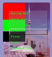
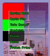
We additionally developed anti-interference (AI) outlines for text and borders of objects, based on feedback from prototyping (Figure 6) [4]. These AI graphics use an opposing contrast level outline to encircle the object or letter (e.g., white objects have black border outlines). This has dramatically improved visibility and distinctiveness of items in transparent foreground menus and windows. Work and evaluation in this area is on-going.
 |
 |
|
| FIGURE 6 (a). Plain font style, | (b). "Anti-interference" | |
| 20% transparency | (AI) font style, 20% | |
| transparency |
We believe that interface designers can take advantage of both the intrinsic properties of the task and of an understanding of human visual attention to design new display techniques and systems. The design space proposed in this paper supports the idea of active/passive tasks by providing users with an awareness of one task while they focus on the other. In this way, inherent characteristics of the task are supported in the interface while providing enhanced functionality. We believe that results thus far show promising advantages for creating new user interfaces and interaction techniques. We are exploiting possibilities of new technology in a way that is sensitive to both psychological and task constraints.
2. Bier, E. A., Stone, M. C., Pier, K., Buxton, W., and DeRose, T. D. (1993). Toolglass and magic lenses: The see-through interface. Proceedings of SIGGRAPH'93. Anaheim, CA.
3. Cohen J.D., MacWhinney B., Flatt M. & Provost J. (1993). PsyScope: A new graphic interactive environment for designing psychology experiments. Behavioral Research Methods, Instruments & Computers, 25(2), 257-271.
4. Harrison, B. L., Zhai, S., Vicente, K. J., Buxton, B. (1994). Semi-transparent User Interface Object: Supporting Focused and Divided Attention. Cognitive Engineering Lab Technical Report CEL-94-08, Dept. of Industrial Engineering, Univ. of Toronto, November, 1994.
5. Ishii, H. and Kobayashi, M. (1991). Clearboard: A seamless medium for shared drawing and conversation with eye contact. Proceedings of CHI'91, Monterey, CA, 525-532.
6. Jensen, A. R. & Rohwer, W. D. (1966). The Stroop color-word test: A review, Acta Psychologica, 25, 36-93.
7. Kabbash, P., Buxton, W. A. S., and Sellen, A. (1994). Two-handed input in a compound task. Proceedings of CHI'94, Boston, MA., 417-423.
8. Kahneman, D. and Chajczyk, D. (1983) Tests of the Automaticity of Reading: Dilution of Stroop Effects by Color-Irrelevant Stimuli. Journal of Experimental Psychology: Human Perception and Performance, 9 (4), August, 1993, 497-509.
9. Knowlton, K. C. (1977). Computer displays optically superimposed on input devices. Bell System Technical Journal, Vol. 56, No. 3, March, 1977. 367-383.
10. Kobayashi, M. and Ishii, H. (1994). DispLayers: Multi-Layer Display Technique to Enhance Selective Looking of Overlaid Images. Poster from CHI'94 Conference, April, 1994, Boston MA.
11. Kohler, P. A. (1972) Aspects of Motion Perception. New York: Pergamon.
12. Larish, I and Wickens, C. D. (1991). Divided Attention with Superimposed and Separated Imagery: Implications for Head-Up Displays. University of Illinois Institute of Aviation Technical Report (ARL-91-4/NASA HUD-91-1).
13. MacLeod, C. M. (1991). Half a Century of Research on the Stroop Effect: An Integrative Review. Psychological Bulletin, Vol. 109, No. 2, 163-203.
14. MacLeod, C. M. and Dunbar, K. (1988). Training and Stroop-like interference: Evidence for a continuum of automaticity. Journal of Experimental Psychology: Learning, Memory, and Cognition, 14, pp.126-135.
15. Neisser, U. and Becklen, R. (1975) Selective Looking: Attending to Visually Specified Events. Cognitive Psychology, 7, 480-494.
16. Schmandt, C. (1983). Spatial input/display correspondance in a stereoscopic computer graphic workstation. Computer Graphics, Vol. 17, No. 3., 253-259.
17. Stroop, J. R. (1935). Factors affecting speed in serial verbal reactions. Journal of Experimental Psychology, 18, 643-662.
18. Wickens, C. D., Martin-Emerson, R., and Larish, I. (1993). Attentional tunneling and the Head-up Display. Proceedings of the 7th Annual Symposium on Aviation Psychology, Ohio State University, Ohio, 865-870.
19. Zhai, S., Buxton, W., and Milgram, P. (1994). The "silk cursor":
Investigating transparency for 3D target acquisition. Proceedings of
CHI'94, Boston, MA., 459-464.